Showing posts with label Colour Inspiration. Show all posts

Sunday, September 7, 2008

Caroline Ireland and Stained Glass

I went for a slightly 20s hairdo here. The flowers are fibre tipped pen colours. Don't you just love Staedtler fine tipped pens? I am not sure if she is wearing anything apart from the flowers though...!
I like stark white trees on coloured backgrounds. Could be a bit Christmassy with a wee bit of a tweek here and there.
Pen and ink illustration of a woman and a tern. I love terns with their cute black caps. I will have to try and get my ladies to "smile". They all look far too serious for my liking. Mind you having a bird about to entangle itself in your hair is probably quite a serious matter.

Pen and ink with digital colouring. I had high hopes of this one originally but it didn't turn out as I intended. I suppose it is an example of co-ordination with nature. Oh well, you win some and you lose some.


Some examples of stained glass windows found local to my home. You probably need to click on them to get a clearer version.


The following images are of artwork by Caroline Ireland and are produced using a combination of wet watercolour and pastels. I think my favourite one is the bird in the tree. It is a magical explosion of colour.


Sunday again and time for another blog. I spent some time doing one of my favourite things this week, and that is looking in old churches. I love everything about old parish churches and even better if they are over 500 years old. I think so much prayer, meditation and thinking of others in churches becomes embedded in the atmosphere, and I must say I have never been in a church and felt uncomfortable. I particularly love looking at and photographing stained glass windows. Admittedly much of the stained glass we see in our churches today is Victorian or later. The very first churches had plain glass windows. I stand and gaze in awe at the artistry and craftsmanship of the men and women who designed and made these beautiful objects. A bit like wonderful monumental sculptures of angels in churchyards, they are often overlooked. Not by me though. A church local to me actually has a tiny stained glass window dating from the 1300s. Isn't that incredible?

I have posted a couple of my photos of windows that I have discovered in my travels. Stained glass has a unique quality of colour that cannot be replicated by any artistic media that I know of. It has a intensity and vibrancy all of its own and although we all try to replicate that, we never can. I certainly cannot anyway. I have quite a few books on stained glass which I like to browse through now and again when I am looking for inspiration for colours. I particularly like the depictions of angels with the fabulous colours and patterns of the wings and the robes.

Anyway, to change the subject; my featured artist this week is Caroline Ireland. I have long been an admirer of her work but it is not for the minimalist. Her artwork has colour in spades. In fact, I think she probably uses every single shade of colour known, in each picture. I love them for their vivid, beautiful colours and patterns and mystical subject matter. She can be found at the totallyessential website here. If you click on the artists directory at the top, then click "I" on the alphabet, it will show you Caroline's name second down on the list. Some of the pictures I have posted are no longer on the website but she has lovely work there and it is well worth a look. She does with colour what none of us would dare.

Well, that is all from me this week. Hope you enjoy my artwork. I have placed it well away from Caroline's....lol.

Sunday, August 31, 2008

Primavera....A Little Early

Anyone who reads this blog regularly will recognise this from the pen and ink drawing that I originally posted a couple of weeks ago. It has taken forever to colour on the computer but it is finally finished and is quite pleasing. It is called Primavera which is Italian for spring. Lots of leaves this week.
I am very pleased with this image as it turned out better than I had expected. I used my 85 year old mum as a model for the hands holding the apron. It is pen and ink with digital colouring and is called Gathering the windfalls.
I decided to go a bit mad with the hair here but I like it. A very elegant lady indeed.
Can't possibly have a blog post without a tree somewhere
Just a practice drawing of long hair
The following images are of Kirsten Glasbrook's tapestries, a page from her book and the front page of the book. I hope you enjoy looking at them.


It's been a bit of a "pickly" week, this week. Not quite sure why but lots of things seem to have gone awry for some reason. Even simple things that should have been easy had their own particular gremlins. Drawings that should have practically drawn themselves have worked out quiet ways to be awkward and not do what I wanted them to do. Sometimes I think they must have a life of their own.....no, not really but it sometimes feels that way. I often start out drawing something in a sketch book and I have a good idea of what I want it to look like but during the process of making it into a "proper" drawing, something happens and it goes off in a different and unexpected direction. Sometimes these are good and sometimes they are completely wrong and the picture ends up in the bin and I have to start again. I am sure all artists and craftspeople have much the same problems. Something to do with the creative process we are told: whatever that may be.

One incredibly useful tool, of course, is the computer. Oh the hours it saves me. I can create an image and whereas in the past I would ponder over what to do next, nowadays I just have to scan the image into photoshop and fiddle with it to my heart's content. When I have decided, I can go back to the original and know that I am not going to ruin it. Some people would say it takes away the spontaneity but who cares about that, if the end product is the best image possible, and who can spell spontaneity anyway. I can, but only because I have just checked with the computer on answers.com. I was very resistant to computers for many years but once I had one the addiction started. They make life so much easier that I wonder how anyone can manage without one.


Talking of computers, I am very upset to find out that my favourite website "Statcounter" has disappeared into thin air. I love checking my blog stats to see who has been for a visit and even nicer, who keeps returning. I am statless at the moment but hopefully that will soon be sorted out by dint of Google Analytics. Hopefully Statcounter is only having a bit of a glitch and will return soon. Then I will have two websites to check my stats with....hurrah. Oh and thanks to my brother and his partner Lesley for very valuable computer assistance without which I would be in a very deep muddy hole with steep slippery sides.


My featured artist/craftsperson this week is actually someone I have met. She is a Danish tapestry weaver called Kirsten Glasbrook and she creates the most wonderful pictorial tapestries. Her style is contemporary but with a folky twist and a definite hint of myths and legends. I met her when she was exhibiting at the Waterperry Art in Action show near Oxford a few years ago. She had transported a huge upright loom into the marquee and was showing people how she creates her work. I was hooked from then and when she produced her book on tapestry weaving I was probably one of her first customers. Her website is well worth a look - Kirsten Glasbrook. I have included several of her lovely tapestries and if I came into money I would definitely buy one. I cannot weave by the way.

Saturday, August 2, 2008

Colour Wheel, Balance and One White Horse

White Horse - Digital Artwork


Thought I would try a spot of architectural pen and ink drawing for a change
Balance - Digital Art


Sketch for "Balance" drawing

Dulux Paint Colour Cards in a very messy wheel


Peace Rose


Late again with the blog. I really don't know where the time disappears to. I swear time has speeded up in the last few years.


I have been adding to my extensive collection of Dulux Colour Cards lately. Our local DIY stores do the full colour range and I absolutely love them. I just sneak a few out at a time though. I love to go through all the colours when I am stuck for combinations of colours in a picture. They are very useful to just place together to see how the colours look like side by side. I am not sure I would want walls painted some of the darker shades but as an adjunct to art they are priceless. The ones in the photo are not in the correct spectrum order but I didn't have time to sort them out. I will do so one of these days because I think they have more impact that way. I often use colours in the order of the spectrum in my pictures. Nature knows best which colours go with which colours.


I have been busy computer painting this week. My white horse took absolutely ages to colour but I am pleased with the final result. The only thing wrong is two of the turquoises look very similar in shade when printed whereas on the computer one is much darker. It is my fault for using colours without printing them out on paper first. I must remember that in future.


I want to thank Mellanie "Genxsters" this week for awarding me an "arte y pico" award for posting a blog she enjoys reading. It was very kind of her. She is a very talented artist with a great ability to produce lifelike portraits among other things. Pop over to her blog here for a visit when you have a spare moment.


I am also quite pleased with my "balance" drawing. This was originally a bit of a sketchbook doodle but she gradually developed ballet shoes and I thought she needed to go "en pointe". I didn't even do too badly with the hands this time either. I have posted a picture of the sketch so that you can see how she started out. At some point her hair turned into side buns and she lost her "heart". Still that is the beauty of art - you can do what you like with it....lol.

Friday, July 18, 2008

Oxford Churches And Books, Glorious Books

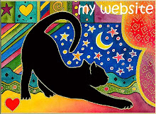
I love drawing this simple black cat shape with crazy coloured backgrounds. I have used this image quite a few times for various pieces of artwork and it still has a lot of mileage left. I love the posture of this cat and the position of the tail.


A pointillist ink portrait of a young woman with a megalithic stone structure in the foreground. This took many weeks of work.


Pen and ink sketch of Art Deco bird and flowers

A selection of clay figures from my newly purchased book. There are another 495 like this. Click on the image to enlarge.


Eye candy for the artist - my purchases from Oxford


View of the beautiful box pews in St. Mary the Virgin at Oxford


I decided to make a visit to Oxford on Thursday. It is somewhere I haven't been for a long time but I decided I needed some me time, so off I went. It turned out to be a cross between retail therapy and church visiting. I love looking round ancient churches and Oxford has some lovely ones. The first one I visited was in a spot where a church had stood for over a thousand years. I love the feeling of sanctity of space in these places which has nothing to do with formal religion. The spaces which churches now occupy were sacred long before Christianity, but I think the worshipping of hundreds of thousands of people has increased the feeling. The second church I visited had some amazing old box pews still insitu. The majority of our parish churches have lost their box pews to conventional pews or chairs. I loved the feeling of cosiness tucked into my little box with the door shut. I should image the congregations of old could snuggle down to some sleep when the sermons got too lengthy.

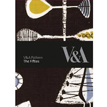
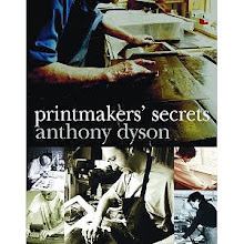
My retail therapy consisted mainly of bookshops. Oxford has some great bookshops due mostly to the presence of the Universities. I have included a picture of my purchases which include a wonderful book called 500 Figures In Clay and another book which features lovely ceramics and shows step-by-step photos of how they were made. My third book was a Directory of Printmakers which details over a hundred printmakers with their work in full, glorious colour. I am neither a ceramicist or a printmaker but I love to look at the work of other disciplines and gain inspiration from them. I found some lovely greetings cards from another bookshop, but this time in Thame. They had a fantastic display of more designer-type cards and not just the mass produced ones. I could have bought lots more cards, but when I added up the cost of the books I didn't dare. Oh and I forgot to mention the two new pens and the "long" A5 sketchbook for doing my landscape sketches in. I think that just about covers everything. No clothes shopping - I didn't have time!

Sunday, July 6, 2008

Lapwings and Digital Colours

A pointillism lapwing drawing which I used for a Christmas card design a few years ago. These runner ducks are one of my favourite motifs and I have used them in lots of drawings and paintings. I think they are just a lovely little composition.


A digitally coloured sketch of a tree which started out as a pen and ink drawing until I played around with colours.
Digitally coloured sketch of a very colourful, stylised tree


Two versions of "Flower of Friendship" - not sure which one I prefer.


I have been doing a bit of doodling with digital drawing this week. I have to be in the mood for drawing on the computer. It is very time consuming as everything has to be so large and can take hours to produce anything. The white runner ducks on blue drawing is a proper artwork but the others are just playing around with shapes and colours. I do like the matt effect of pantone colours and enjoy looking at work other people have produced digitally.


The pointillist picture of lapwings is one I did for Christmas cards a few years ago. I have always been fascinated by lapwings with their little feathery headpieces. I was lucky enough to see some in real life a few weeks ago whilst out with friends in Oxfordshire. It took my brother to point them out though, but once I knew what they were I recognised them...if that makes any sense. They were quite annoyed with us for walking in the vicinity of their nests.


The flower of friendship drawings were ones I did sometime ago which never quite got off the ground. I am sure everyone has some of these tucked away somewhere. I still like the design and will probably eventually complete it but I am not sure which colourway I prefer....decisions, decisions.


I also noticed today that my "love in a mist" flowers are about to bloom. I love these flowers and hope to get a few nice photos of them when they are in bloom. I have nurtured them from seedlings and they have done very well. The garden is very wet at the moment due to all the rain we have had today. Summer seems to have deserted us for the moment. I daresay it will return one of these days.